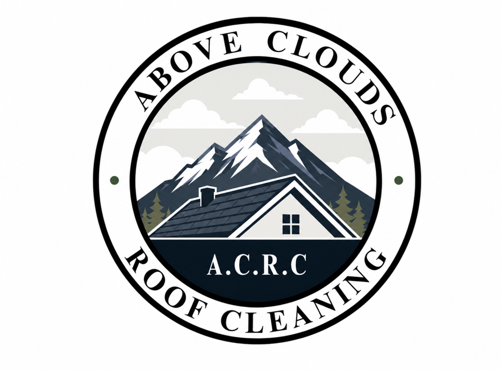
Logo Refresh
From rough concept to polished brand mark.
A stronger logo direction with improved balance, contrast, readability, and a more professional first impression.
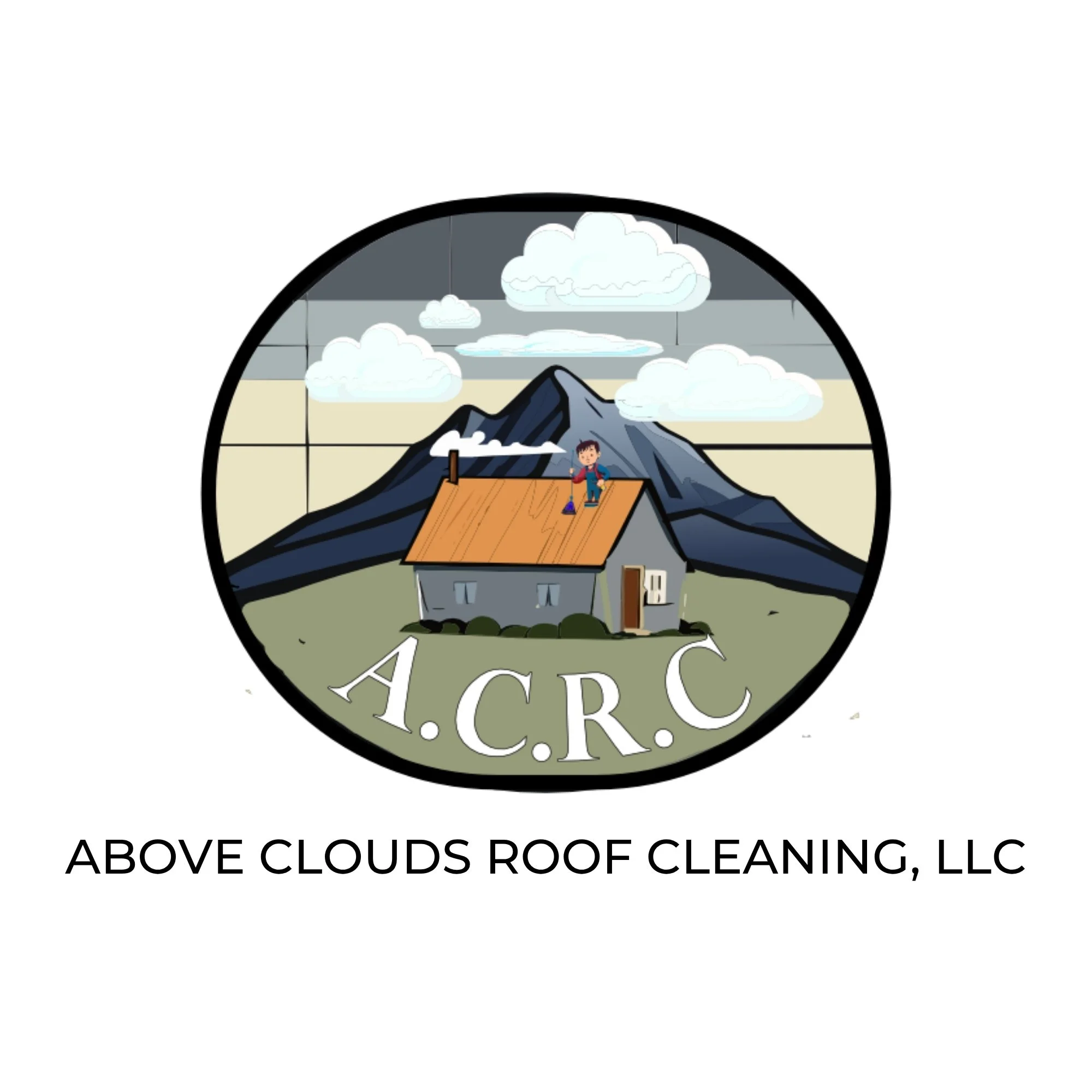

The refreshed direction keeps the recognizable mountain and roof concept, but simplifies the structure so the mark feels cleaner, more versatile, and easier to use across digital and print materials.
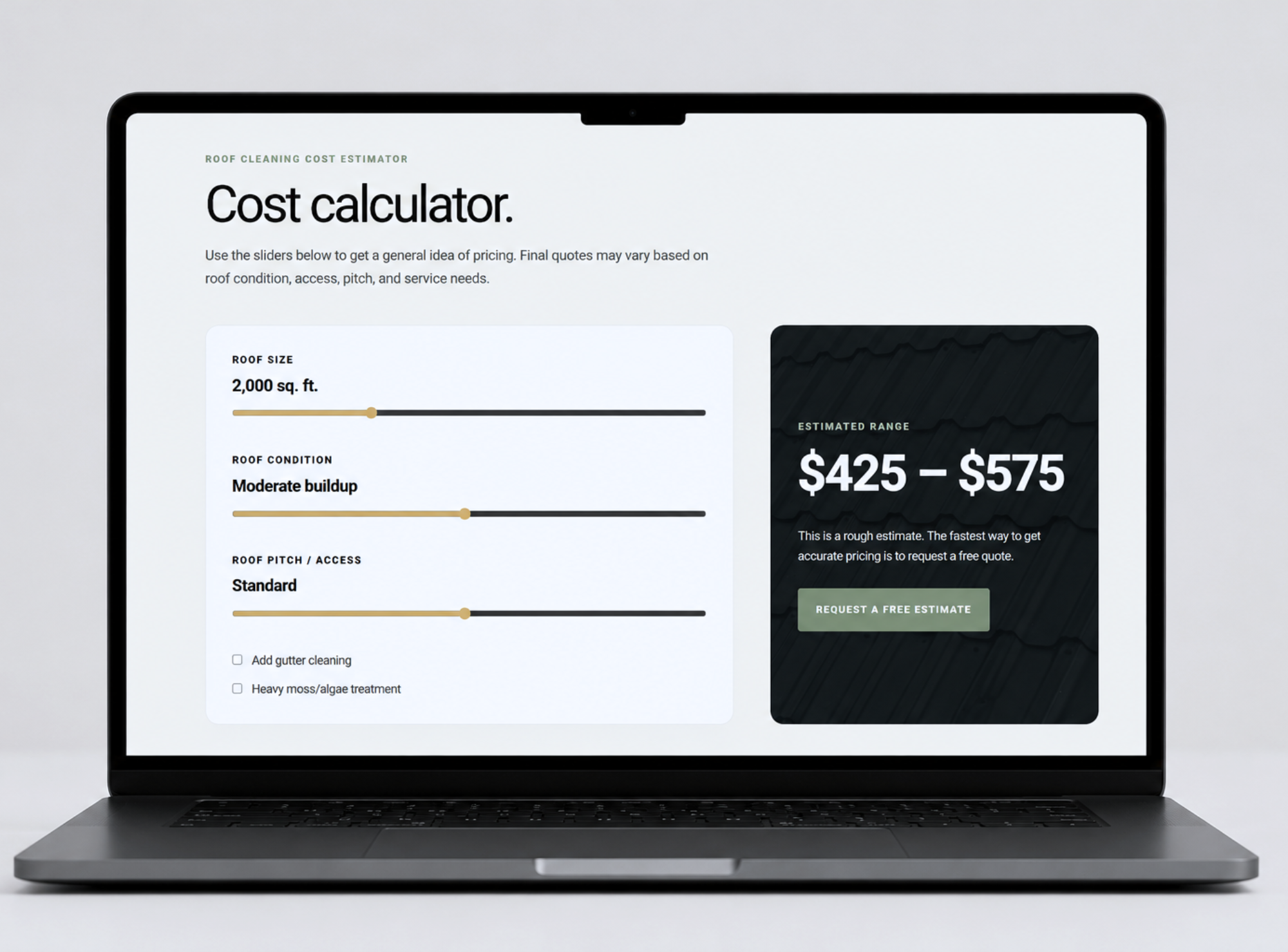
Website Redesign
ACRC Website Refresh
After refining the logo direction, the website needed to carry that same stronger, more polished identity. The goal was to create a homepage that felt premium, trustworthy, and clear while helping homeowners quickly understand the service and request an estimate.
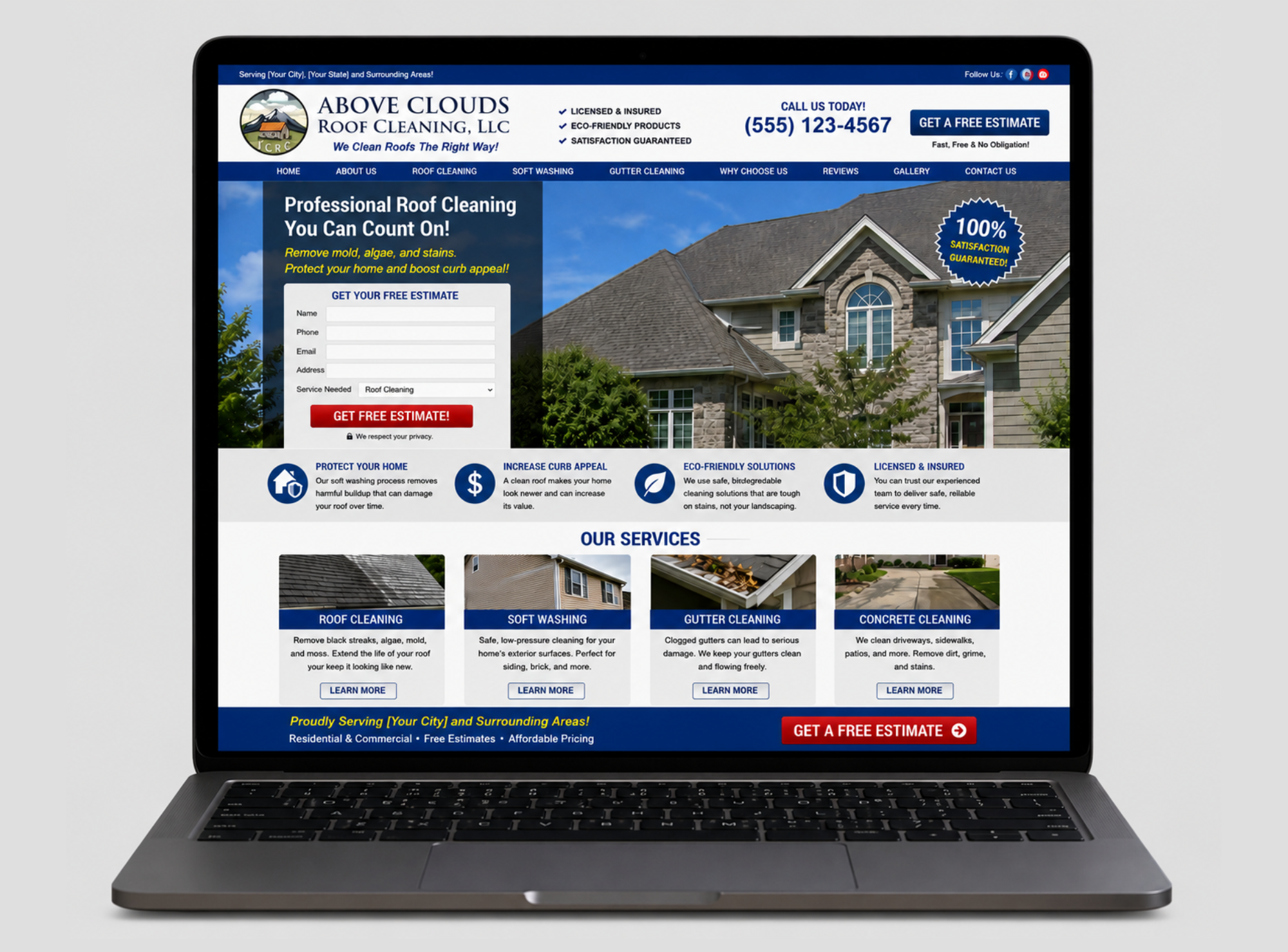
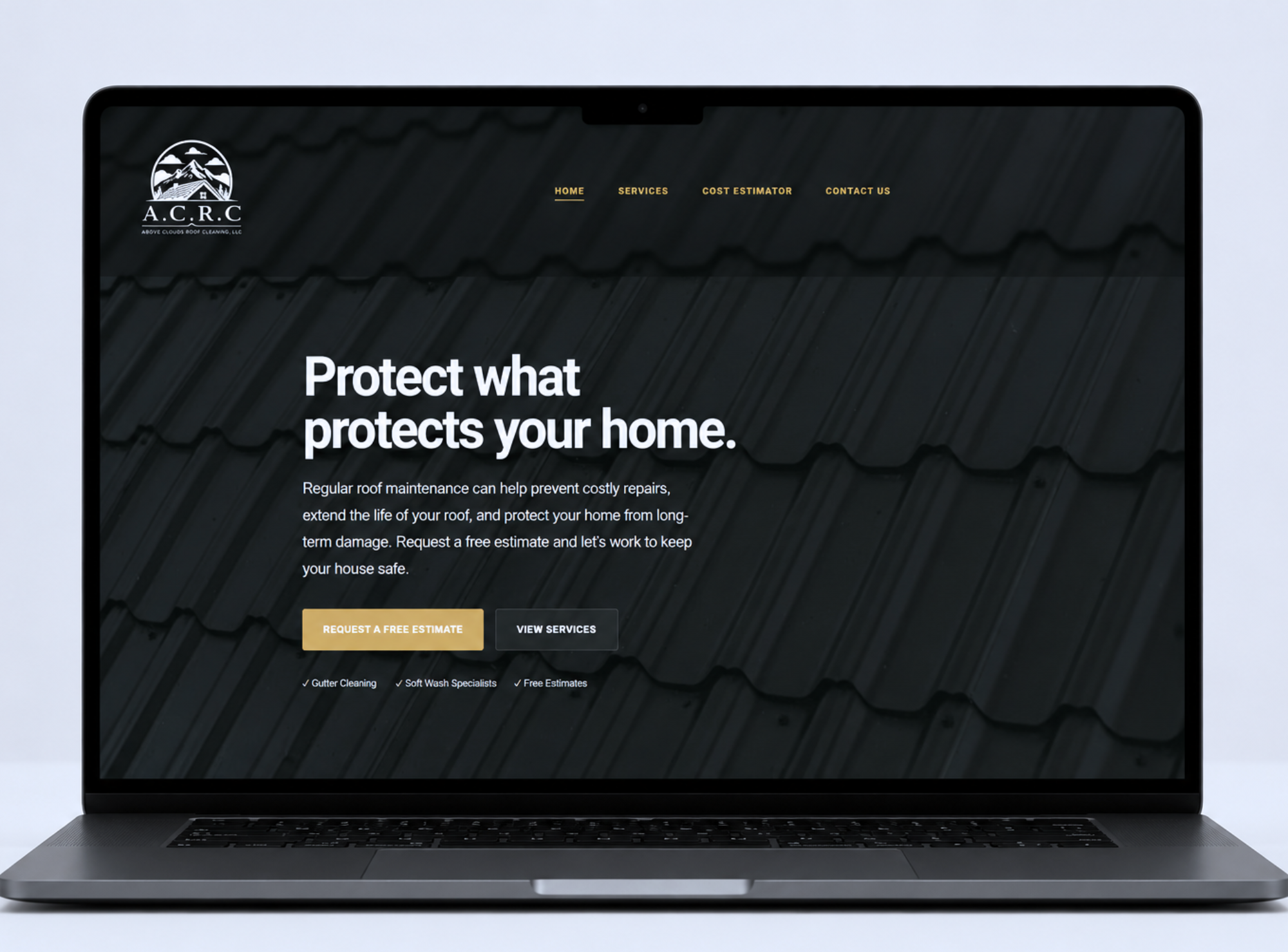
Before & After
A cleaner website experience built around trust and conversion.
This website refresh focused on improving the first impression, simplifying the layout, strengthening the message, and making the estimate request feel more obvious.
Before
After
The refreshed homepage feels more confident and premium while keeping the message simple.
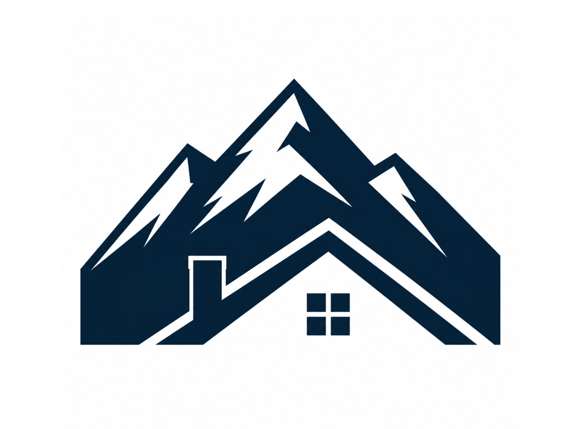
Logo Versions
A flexible identity system for real-world use.
The improved logo system includes multiple versions so the brand can stay recognizable and professional in every format.
Primary Logo
Best for the website, proposals, large print pieces, and primary brand moments.
Stacked / Badge Logo
Useful for social profiles, stickers, signage, and compact placements.
Icon Mark
A simplified version for favicons, profile photos, uniforms, and small digital use.
One-Color Version
Designed for embroidery, decals, dark backgrounds, and simple print applications.

The Result
A stronger digital presence for a trust-based home service business.
The final direction gives ACRC a cleaner website experience and a more flexible logo system that feels dependable, polished, and built for real customer touchpoints.
Start Your Project