
Case Study
Midnight Supply Co.
Midnight Supply Co. is a streetwear-inspired brand identity built around custom hand-drawn typography, bold contrast, and a graphic eye symbol. The goal was to create a logo system that felt expressive, merch-ready, and completely different from a clean modern brand aesthetic.
The Concept
Creating something bold, expressive, and wearable.
This project started as an intentional shift away from simple, polished, modern logo design. Instead of relying on clean typography or soft brand elements, the direction leaned into hand-drawn lettering, high contrast, and a stronger visual attitude.
The brand needed to feel like it could live naturally on apparel, stickers, hats, and other merchandise while still feeling cohesive as a full identity.
- Showcase custom hand-drawn typography
- Create a strong merch-ready logo
- Use bold black-and-white contrast
- Build a flexible identity for apparel and lifestyle products
Exploration
Starting with personality.
Early exploration focused on creating a logo that felt imperfect in the right way. The lettering was drawn by hand to give the brand a custom, expressive quality that could not be replicated by a standard font.

Initial concepts explored bold lettering, mystical symbols, and high-contrast illustration.
Refining the lettering and simplifying the eye illustration helped the logo feel more intentional.
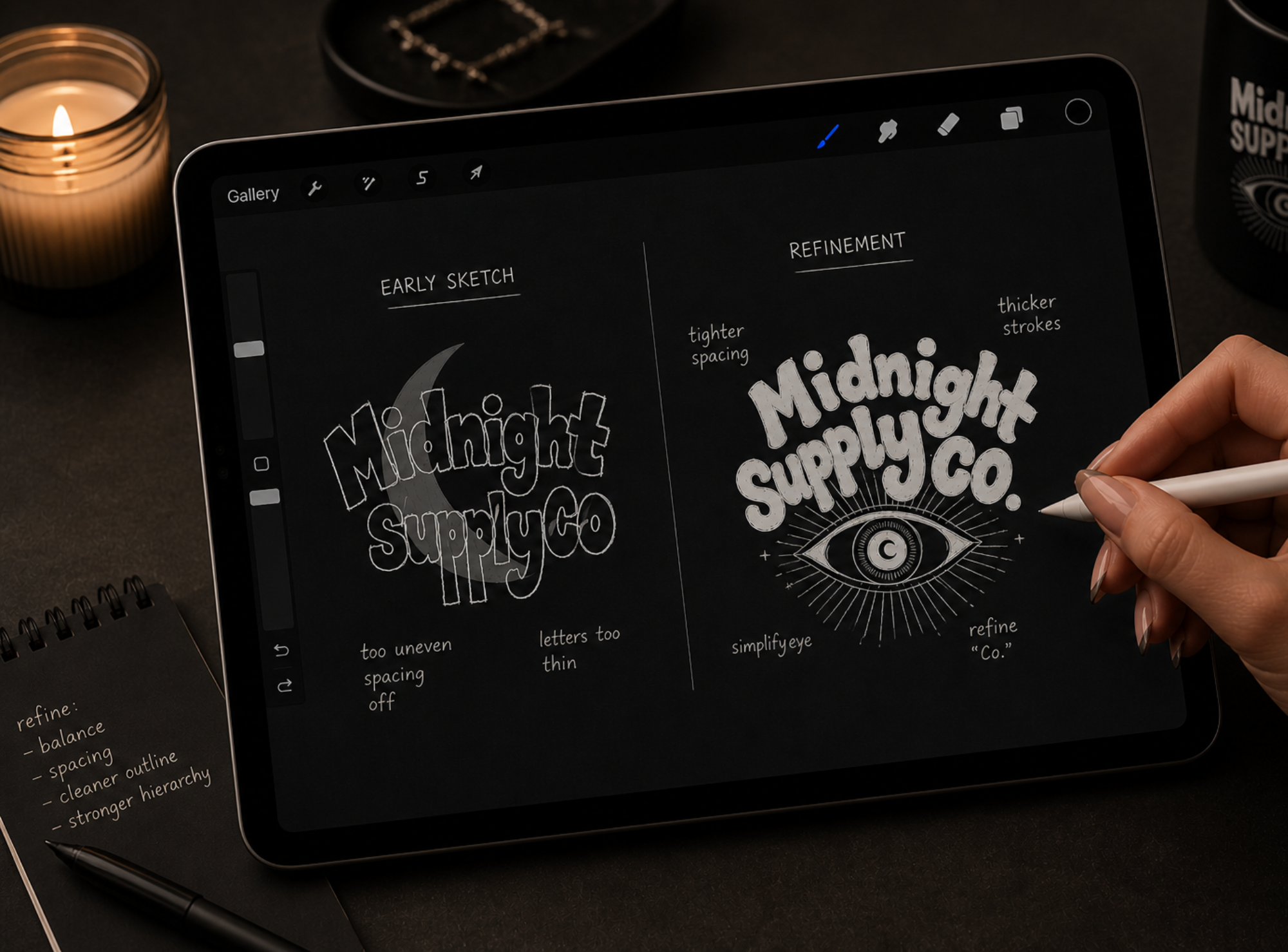
Refinement
Keeping the hand-drawn feel, cleaning up the execution.
The biggest challenge was refining the logo without losing the personality of the original hand-drawn lettering. As the direction evolved, the concept shifted from the moon to the eye, which felt more distinctive and visually impactful. From there, the focus moved to tightening the overall composition—especially the spacing between the “y” in Supply and “Co.”—while maintaining the organic feel of the type.
At the same time, the eye symbol was simplified and the surrounding rays were adjusted to better match the weight and style of the lettering. The linework was smoothed and slightly rounded to introduce a more cohesive, subtly bubbly look. The final result preserves the expressive, hand-drawn quality while bringing in more balance, clarity, and intention.
The result feels cleaner and more scalable, while still keeping the raw, custom quality that made the original concept strong.
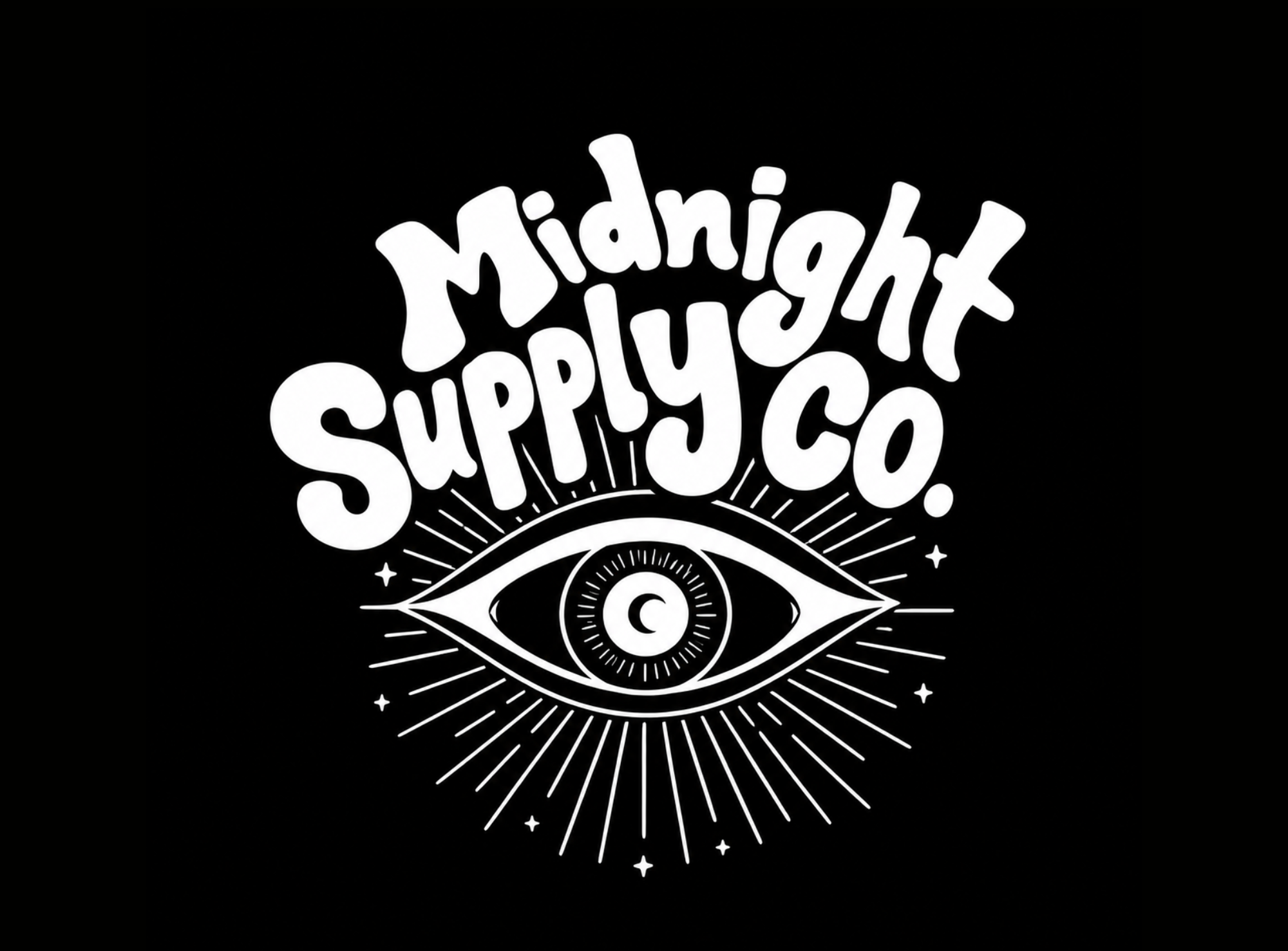
Final Identity
A flexible streetwear logo system.
The final identity centers on a bold primary logo featuring custom lettering and an illustrated eye. The eye symbol can also work as a standalone mark for smaller applications like tags, embroidery, stickers, and hat details.


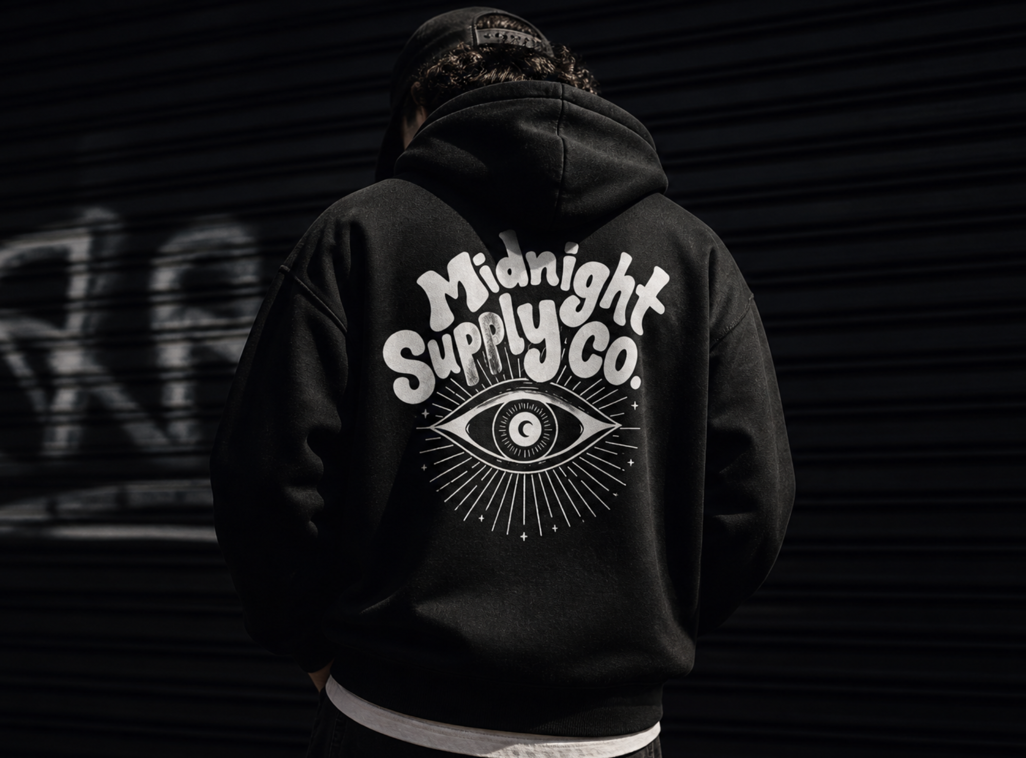
Application
Designed to live on apparel.
The logo was applied across t-shirts, sweatshirts, and hats to test how the brand would translate into real merchandise. The high-contrast design allows the identity to stay bold and readable across multiple apparel colors and placements.


The Result
A bold, hand-drawn identity built for lifestyle and apparel.
Midnight Supply Co. shows how custom lettering and strong visual direction can turn a logo into a flexible brand system. The final identity feels expressive, wearable, and distinct from more traditional small business branding.
Start Your Project