
Case Study
Honey & Hearth
Honey & Hearth is a modern bakery and coffee bar concept created to feel intentional, trustworthy, and quietly elevated. The challenge was finding the balance between warmth and simplicity. Moving away from a “cute home bakery” feel while avoiding anything overly corporate or cold.

The Concept
Balancing warmth, trust, and restraint.
The brand initially struggled between three directions: a cozy handmade bakery, a clean modern coffee shop, and a slightly boho aesthetic. The goal was to unify these into a single identity that felt calm and intentional. Something customers could trust at first glance.
Rather than relying on literal visuals like honey, bees, or rustic elements, the direction shifted toward a more restrained, typography-led approach designed to last.
- Feel calm and trustworthy at first glance
- Work across signage, packaging, and digital
- Avoid overly decorative or trendy visuals
- Remain relevant long-term
Exploration
Starting wide.
Early concepts explored literal interpretations of the brand. Honey, bees, jars, and hand-drawn typography. While these communicated the idea, they quickly began to feel overly decorative.

Initial exploration focused on generating ideas before narrowing direction.

The shift toward typography and simplicity.
Direction Shift
Removing the unnecessary.
The direction moved away from illustration and toward a typography-led identity. Focus shifted to proportion, spacing, and hierarchy, allowing the brand to feel more refined without losing warmth.
Final Refinement
Building a flexible logo system.
The final identity centered on a strong monogram, supported by a secondary badge for smaller applications. The primary logo remains clean and minimal, while the badge provides flexibility for stickers and packaging.
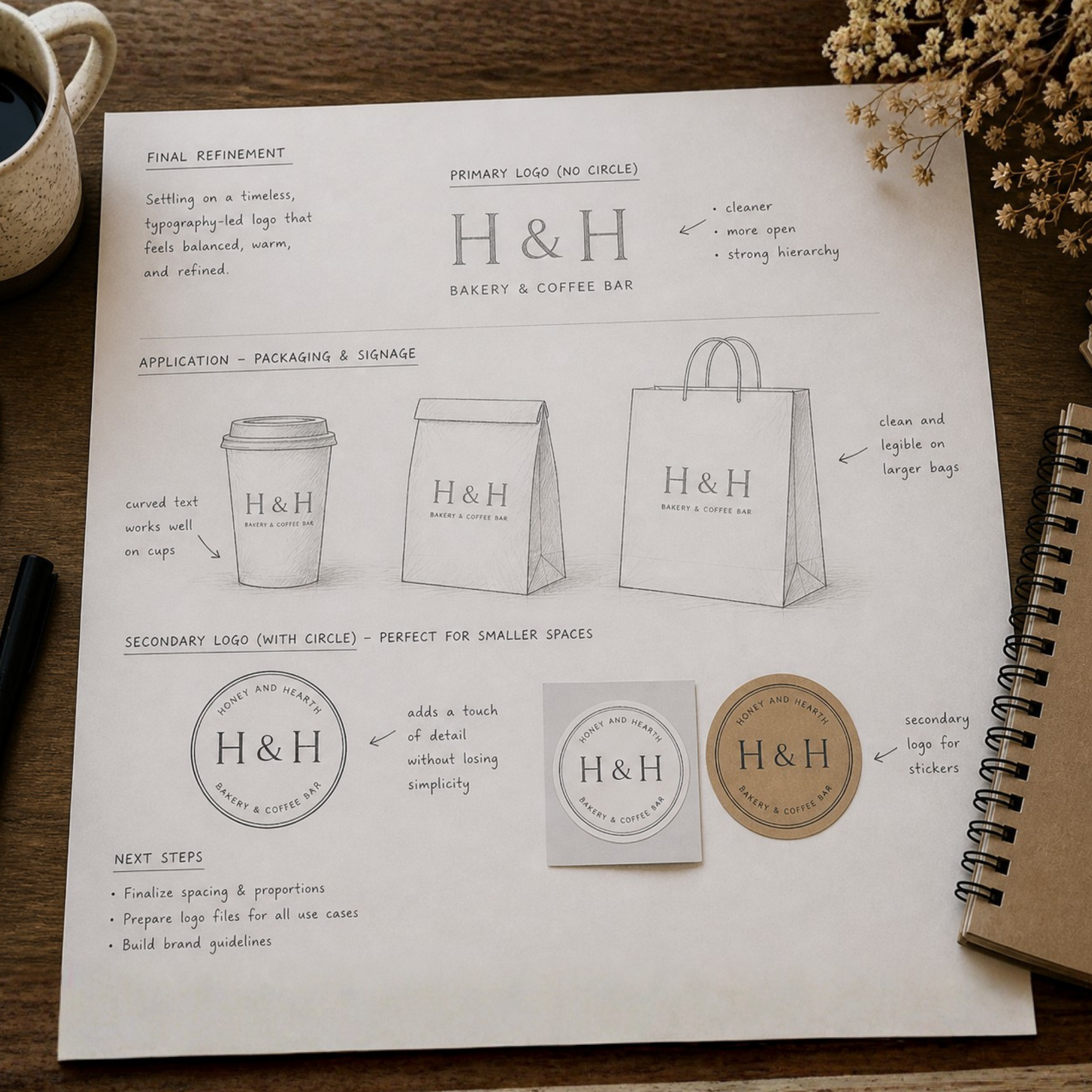


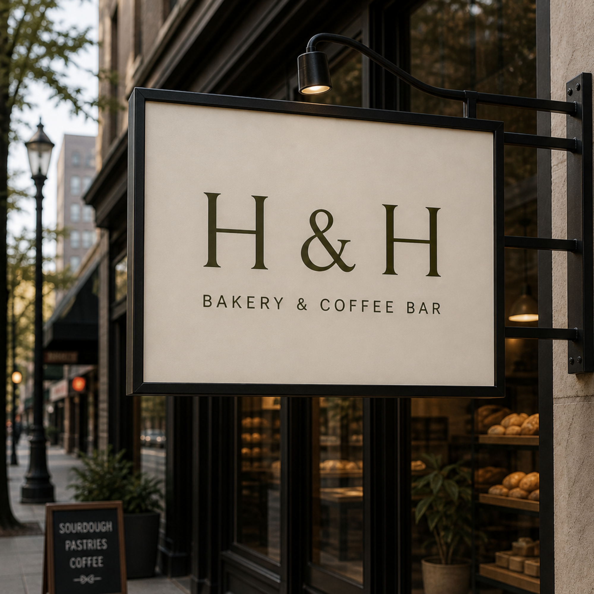
Application
Designed for real-world use.
The identity was applied across packaging and coffee materials to ensure consistency, clarity, and usability across touchpoints.

The Result
A brand that feels calm, intentional, and built to last.
The final identity balances warmth with restraint, creating a brand that feels approachable without relying on trends or decorative elements.
Start Your Project